Deadline extreme! 42 pages in one hour , the last hour of 2020. Give ourselves gifts in 2021.
The 1-Hour Coloring Book
Like all of us, I need to get through the resistance some times. I over-think everything. I don't know my own voice. I'm adhering to someone else's standards. And I'm afraid of what everyone will think if I fail, and I know I will fail.
One way out of this is to produce work, lots of work, and to damn the torpedoes as far as the critical voice goes. (We can use our critical voice later, when we need a dialogue about who we are, what our style is, what we want to say...)
How to do this?
One way is deadlines. Work fast. One way is to work extremely fast.
Also, we have to remove the worry that what we do matters. Can we work with effort, and be care free and confident? I think so.
One game I create as an exercise, was to color a whole coloring book in 1 hour. Coloring books don't matter! You can't fail at coloring! (I know, you're all saying "I can!" but really, just roll with this one, ok?)
So, I did this exercise on New Years Eve, the last hour of 2020 (good riddance!)
1 hour in 28 seconds.
That damned critical mind.
Give the critical mind something to chew on. Give it a fucking PROJECT! Give it 42 pages of art to look at, and to try to piece some patterns out of.
Part of the exercise was to reflect LATER, on what it was I did.
Try to figure out what is going on. True, the critical mind will hate some of it, fine. You don't have to go along with it, or you can, but let's be a little more objective and see what was going on. What did YOU do? What did you feel? What did you RESORT to? What came out? How can you refine it?
Another part of the exercise was to TRY. Try to make something nice. Be fast, but don't settle. There were times I took an extra few seconds to add sparkles or one last color, stuff like that.
Here's my 42 pages of coloring, and what I remember, what I felt, what I was going for, and what I wanted to do, had to do, or did!
I started at about 11:01 or 11:02 pm. My goal was to finish exactly at midnight (and I did!)
This was my first page. I think it took 3-4 minutes. There are 5 or 6 colors, marker, crayon AND watercolor. I was having fun, but I was clearly already behind.
Page 2. Still working slow (2-4 minutes), but faster. Added the watercolor stripes at the end I think.Letting the lettering be loose. I liked the accidental highlight I made in her hair last page and tried to keep it going this page.
3. A little faster, less content, of course. The dark green and light green was not a conscious "difference", I was still just in the more is more attitude. Added the sparkles because I couldn't make the faces different.
4. I'd established the cat was green (I hate that cat!) and wasn't going to change now. Only 4 colors here, and the blue was scribbled as fast as I could.
5. What I remember about this was adding those watercolor building smears at the end. Again, I had to TRY.
6. Simple. Again, I had to try, so multi-colored letters. Also, the characters with blue augments was nice. One thing I learned at this point, that I already knew, but was really hammered home. I always let my materials go bad. These markers were really lousy I was not getting good coverage at all. (And they're my daughters! I need to replace them for her.)
7. Thrown for a loop here, because it was an activity book and not a coloring book. So how to make this interesting? I drew vertical lines threw some letters, tried to vary to make a nice pattern. I filled in the sides of the clouds first with yellow, then green marks, the fast orange and blue marks. Arrow at top tells the story. Onward!
8. Like the green cat, I chose green for his skin, but lighter. And I already found a way of coloring his hair by accident that I liked. The back 3 or 4 segments, and frontmost segment 1 color. The remaining a second. Got to make the floating faces different colors. Added streaming stars and moved on.
9. Ooh a connect-the dots. I didn't have my glasses but I think I got the numbers right! Quick outline then color the hair something lighter to show it off. I think I accidentally left a part of her dress and so picked a dark blue, again maybe by accident, but it worked well. Whatever that creature is is all orange. Splash and spirals in the back to say I have not forgotten ...
10. Word scramble or whatever! Now I was getting scrambled. I guess I picked yellow by suggestions. The orange shmear showing through from the other side, and not happy with the coloring anyway, I added the yellow to augment it on the left.
11. Ok working fast. Scribbled hair, slower skin, scribbled clouds and diamonds. Letters not very f. pretty.
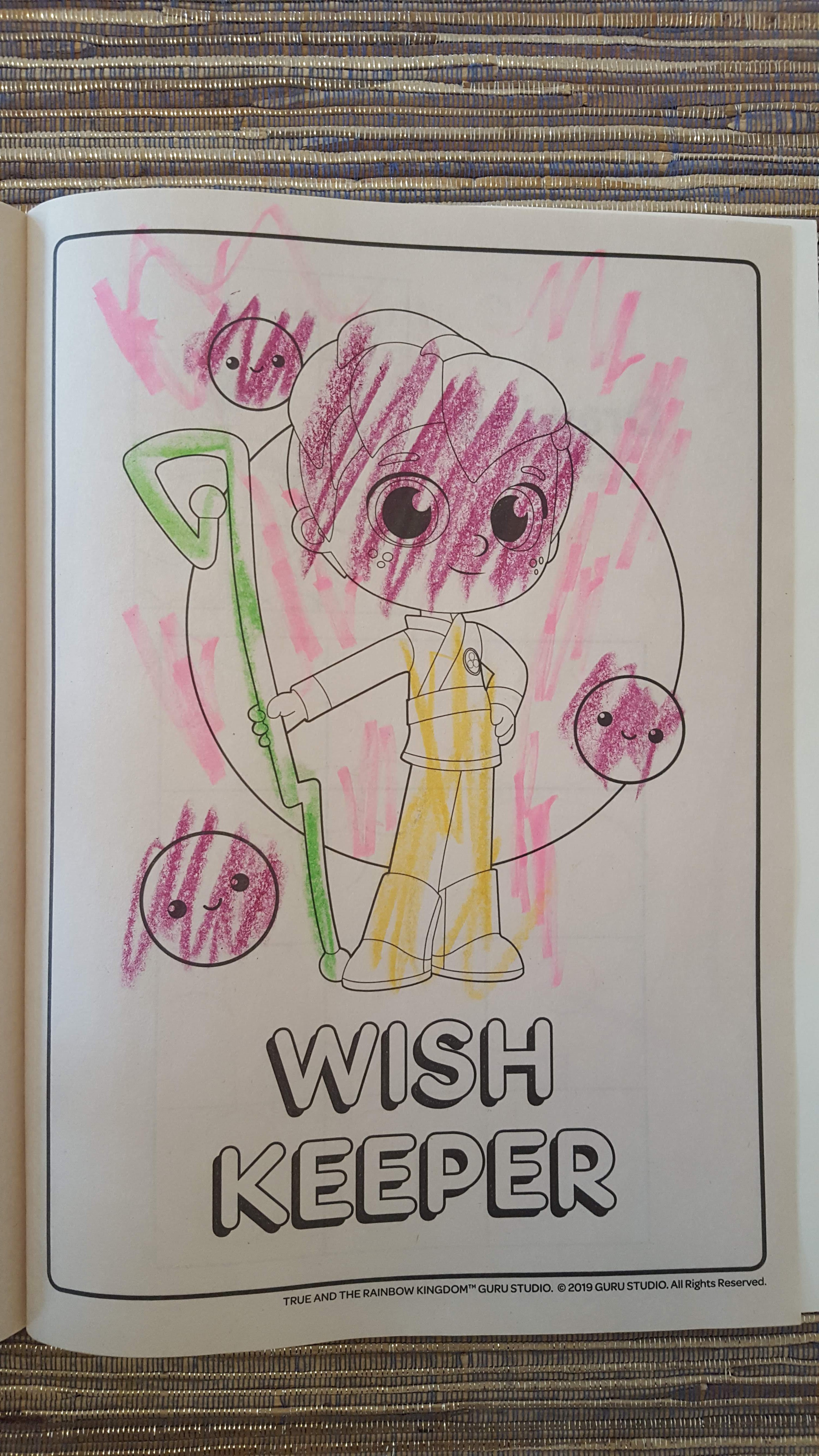
12. One of the best ones, I think. The hair looks great. The small assortment of pink bubbles. When did I have time for two colors on one rainbow stripe? Whew!
13. Design a wish. No time to think! Pizza? Ok whatever! I wish I could have done a few more of these, actually. Maybe I'll design a book to be raced through with 3 or 4 of these. That's a THREE-COLOR pizza. Like I said, you have to try.
14. Utterly hideous. Only good moment here was adding metallic marker at the end, but it was too late.
15. Disappointed by the last page, I thought this was my chance to prove myself to be a genius. The cross of orange under the girl seemed utterly inspired, and the wiping across her eyes on the bottom, subversive and evocative. Diagonal tic-tac-toes and everyone gets emanata. In the end, not the genius page I thought it was.
16. Not really working. But watercolor, and I did number the clouds. Brilliant I tell ya!
17. Started with the yellow and made "yellow" blue to be ratty. Still in genius mode. The two "E's" were the last thing I did, thought those would be the great final strokes of a masterpiece. In reality, I think I've been in a slump since the pizza.
18. Changed it up. Crayons. Big big marks. The dark v on his skin reminded me of Rosalie's head and took me aback for a moment. I think that's why the final surrounding scribbles are remarkably inelegant. I clearly have to use those marks of hers again.
19. Now I was thinking the marks had to be more about energy. Not bad here. I like the lettering. Amazing how exercises like this can bring me back to junior high and high school art class. If I did that mark in junior high (and I did) I would have really thought I was brilliant.
20. Break for a word search but still have to make it good. Some lines, a shmear over True, some yellow grounding, fft.
21. No idea what to do, I made a giant 'A' with a bad marker. It reminded me of a friend's A-Frame house, so I drew people, a really bad ground line, sea line and awful trees. An utter failure, but made me realize I would like to do something about an A frame someday. Not a total loss.
22. Is this one any good? I can't tell.
23. These three colors looked good together, and the all one direction was a quick, efficient decision. I like this one a lot. Not enough power in the background yet.
24. I liked those three colors, so stayed with them. Not great, but good moments.
25. Staying with those colors. Working fast. Not bad. Those emanations at the end are ok.
26. Haha those were supposed to be teeth because I was so frenzied and aggravated. Anyway. same three colors. At least I got to see them in three boxes, side by side.
27. By now, I know I'm sticking with those three crayons. True looks good here, in three vertical swipes. The background isn't bad. Could have done more with those goofballs in the back.
28. Haven't I colored this like 3 times already? Anyway, ok three colors, go, add pink and brown at the end just to not feel the despairing sameness...
29. I'm so in the weeds. Big vertical swaths. I try an alternating pattern of three but mess it up. It's ok!
30. This again? What did I do last time? Some sort of connecting. I try again, thinking about how to make those joining swirls nice.
31. Ooh lots of little things. I got three rad crayons, I can do this. Well, turns out, I can't. Only one or two turn out ok. (Bottom left, upper left, maybe upper right.) I add the movement lines to add some energy it's lacking.
32. A line through the words. Fast colors on True. A swivel for the mountain and some yellow mass for the tree. Not too bad. I think I added a metallic jumping swirl because I was feeling fancy.
33. This again? The pattern, what was the pattern?! Alternating three colors, did I get it? Fill in between with the missing color and GO!
34. HA! How'd I do? Seriously? I love this. That swirl around "Drawing" is lovely. And she looks like Joan of Arc, on fire.
35. Her again, this book is going to kill me. I am not going to treat the foreground like it's special, because clearly it's not. I go in for the background. I can't remember what the green is about.
36. Do not stop the genius from killing it. This page will be obliterated!
37. Not a bad idea with the yellow and green ears, but that's about all. The magenta should have done something else, something rounder.
38. Three colors, this kid, and some letters. I got this, swish swish. This one could be a whole lot worse. What genius added those magenta lines on the balls? Not bad.
39. OMG more Tic Tac Toe. Simple pattern, just lay it down and move on. It has some liveliness to it.
40. Three colors, lots of room to play. Make the balls of the tree resonate with the shapes in the characters. This is one of the top 3, I think. Glad I took the extra moments for the sections of bark of the tree.
41. This one could have been great but I made a misstep with that dark circle on the inside of his face. I think it was early and a hectic part of the eon of the 6 seconds it took me to color this one. Aside from that dark circle, this one is a winner.
42. Whoa, it was 11:59 and I had a few moments to add color from that destroyed pink marker. A swath would have been nice there, but that marker was all I had.
43. MIDNIGHT! Hello 2021!
REFLECTION
Ok, let's be GENTLE to ourselves, let's look at some of them, let's answer a few questions:
What did we do?
What could we have done more of? (And what should we do next time?)
What ones worked?
What ones would be good candidates for revision?
What else?
1. What did we do?
I went from a medium level of complexity to minimum color choice and coverage. I think 2, 4, 6 and 9 are better from the early ones, and of the later ones, 27, 32, 35 and a couple others are high points there. I was eventually genuinely satisfied with those three colors, and could see doing a project in just those colors. I liked it even more when it was gently augmented by metallics or brown.
2. What could we have done more, or what should we do next time?
Have an array of colors ready, maybe three plus 2 others in other materials. Have my materials READY and clean (bad brushes and paint hampered this project.) Start with big swaths. Use the background as main color more often. Augment everything gently.
3. What ones worked?
The ones mentioned above. I would say if I had to pick three (more parameters and deadlines!) are my favorites. Oh heck I picked 6.
In these top three, it was the sharp, boldness of the marks. The confidence.
This one is a sort of fun maximalist one.
I admit part of this is because the underlying drawing is fun, but this is the first the confident scribbles came out and I was still working with a few more colors and here they cohered.
I would do more like this if I could. The connect the dots let me create a bold outline and then different interior. The swath in the background, and augmentations, are good, I like them.
4. What ones would be good candidates for revision?
Using what I learned from the above successes or semi-successes, I would revise some of these similarly. I admit, some are included or excluded because of the drawings themselves.
5. What else?
I would do this again. I would choose different parameters. I would give myself an hour to do 6 or something. I would bring better materials to the literal table.
For my own work, this translates to something like:
I should give myself the deadline of making 10-20 4-panel comics in an hour.
Reflect in this same way.
Choose 2-4 to refine. Give myself 2 days to complete them.
Repeat.
Change system when needed, probably soon.
Of course this is what "fine artists" have done throughout time. The ones with the privilege to follow their instincts. The ones with the privilege to have a "blue period" or a "cut paper" period.
We can give ourselves these gifts. We can recognize who we are in our process, and let us be more of it. We can give ourselves the gift of clear sight about ourselves. The gift of good tools! The gift of time and patience and gentleness.
And we can give the critical mind the gift of something to chew over.
I spent twice as long on this blog post as I did on the coloring book! If we go back into another project, the critical mind KNOWS it will be needed soon, it won't be as furious, tireless, you will have taught it just a little patience.
So in 2021, let's give ourselves gifts. The gifts of knowing that art making makes ourselves, and opens ourselves. We deserve that this year. We've been closed off for too long.
Lovely reflection, Tom. Interesting experience as a reader/viewer as well.
You remind me that I love drawing and writing as thinking...and exploring...and not being hypercritical and precious with my process.
This section of the course intersects with a friend's tweet which I took a screenshot of this morning: "Be free from memory and expectation, meaning be free from the past and future, and delve deeply into the Now. See that with your mind free of baggage--the trip of life is so much fresher, lighter and fascinating.


Comments
You remind me that I love drawing and writing as thinking...and exploring...and not being hypercritical and precious with my process.
This section of the course intersects with a friend's tweet which I took a screenshot of this morning: "Be free from memory and expectation, meaning be free from the past and future, and delve deeply into the Now. See that with your mind free of baggage--the trip of life is so much fresher, lighter and fascinating.